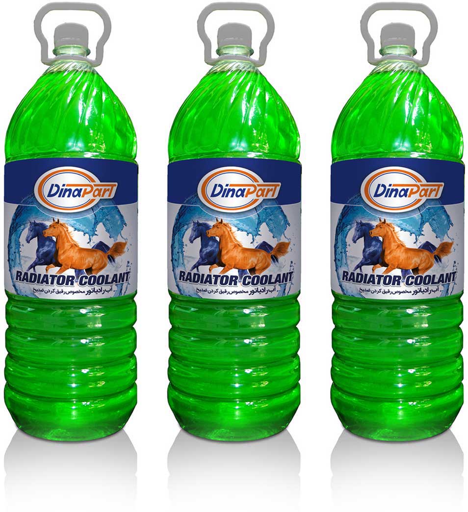
Design for Dinapart Company
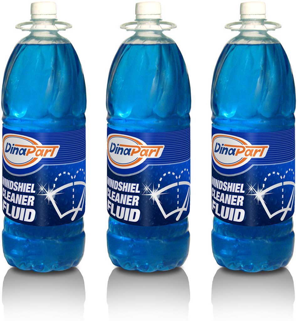
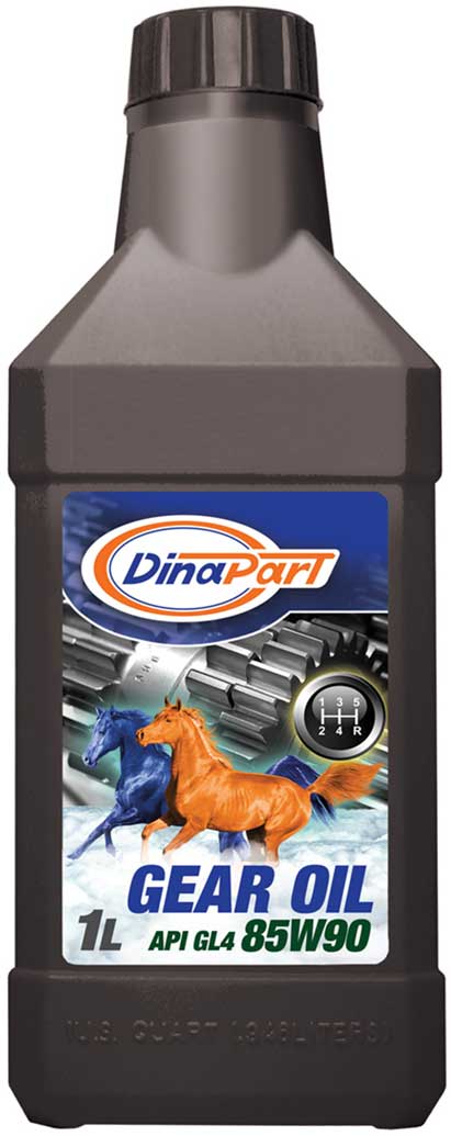
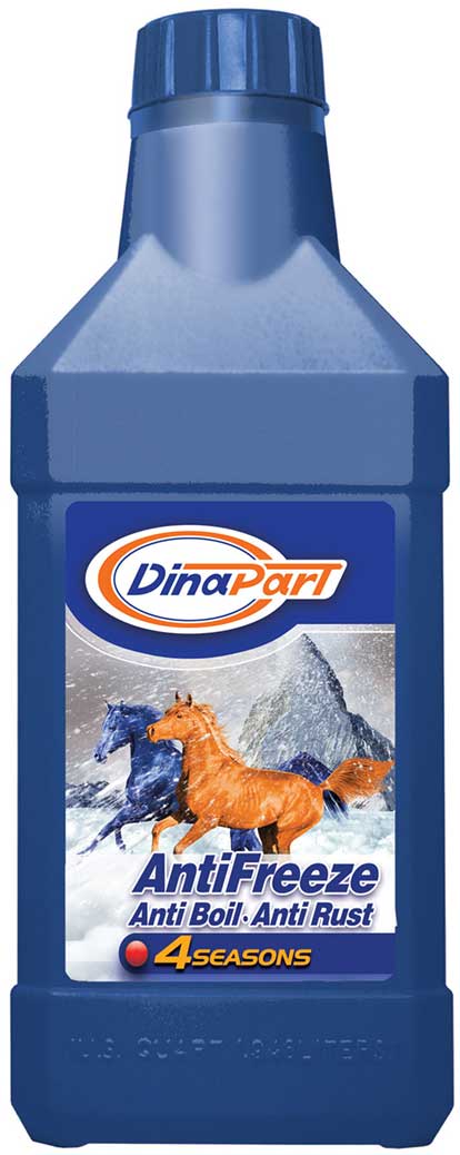
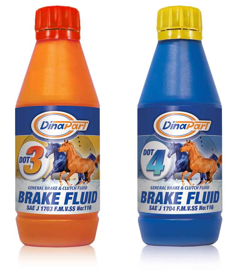
Dinapart, one of the biggest companies in producing spare parts in Iran, decided to provide automotive lubricants and based on Mesh-studio’s experience, I was asked to design the products’ packaging. Our main challenge was the managers’ attitudes who were not familiar with lubricants. However, after some debates and sketches, we found a conclusion. Two golden-orange and dark blue horses became the symbols and were used as the visual identity on packages and galloped in markets. I had a good experience with Dinapart.
Packaging Design | Printing
